Back to the Future.
May 5, 2025This past weekend, I decided to take a trip down memory lane and take a look at the evolution of this blog’s design over the years (with a little help from the Wayback Machine). While I’ve really enjoyed the challenge of making an obsessively backwards compatible blog these last few years, the challenge (and limitations associated with it) has sort of lost its luster; so I figure it was time try something new… and old.
Yesterdays
While I started this blog as a Sophomore in college (and even hosted it out of my studio apartment), the Internet Archive didn’t notice it until I gradutated in 2010. So, while I would love to show you my very early web persona, you’ll have to settle for my post-college design evolution.
2010 - The Ninja Ninja Days
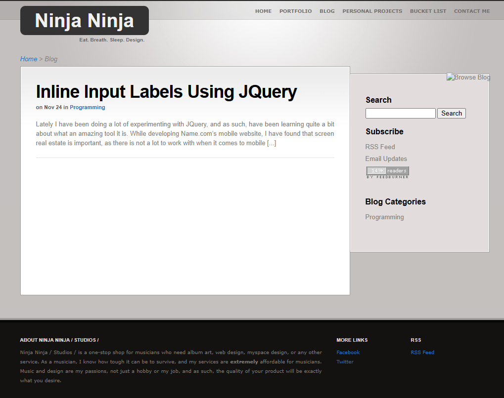
If there is one thing that defines my college-era web presence, it is my unfortunate insistence on creating a “studio brand” for myself. I freelanced quite a bit in college, and thought that I needed to create a “professional” web presence, thus “Ninja Ninja Studios” was born.
To this day, it’s a terrible name. What the hell does “Ninja Ninja” even mean? I don’t know. But I do know that it was so ineffective that the Internet Archive ignored it for four years. Unfortunately, I bought a domain name that got used for so many logins that I can never get rid of it.
2011 to 2012 - Intro to Personal Branding
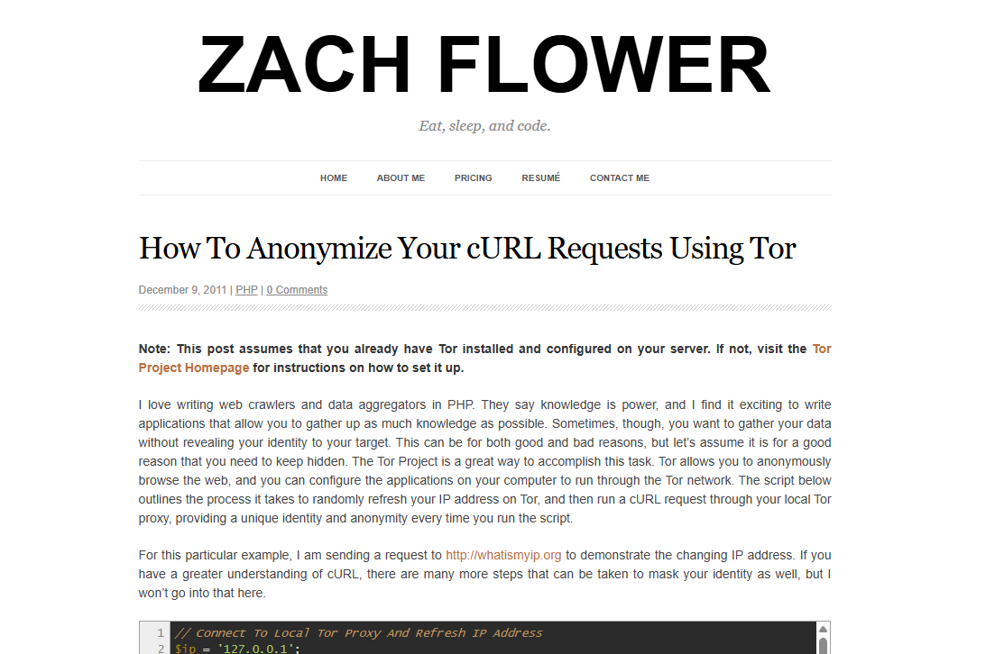
Just after graduation, I leaned into the “personal branding” trend and created a site that was a little more… “me.” I ditched the studio concept and embraced my own identity, centering my work around my name, and my writing around the concept of “development.” As you can see, things got a lot more profesh.
2013 - The Mustache Phase
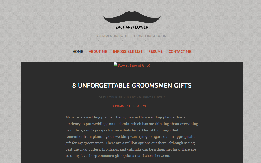
And then… they got a lot less profesh. I don’t know what the hell I was thinking with this design, and why I used a handlebar mustache as my logo—especially considering that, at this point, I was at least 5 years away from being able to actually grow one.
If the point was to introduce more personality, then I suppose I succeeded in that. But I think I was trying to be “quirky” and “fun,” and instead I just ended up looking like a hipster who was trying too hard.
2014 to 2016 - The Bold Color
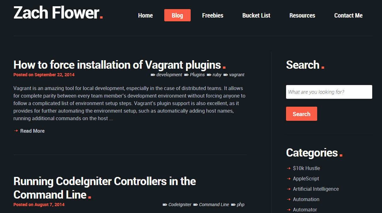
This was the first design that I think I actually liked. I wanted to maintain a more professional aesthetic, while still introducing some personality. Unfortunately, the theme I built off of was called “Selfy,” which appears to have since been scrubbed off of the Internet entirely.
2017 to 2025 - The Minimalist
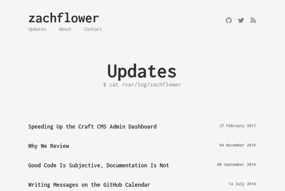
The next 8 years were spent on progessively more minimalistic designs. I kept trying to capture the aesthetic of a terminal application, or text editor, or the 1990’s web. Starting in 2017 (above), I leaned into the “retro” style, with monochromatic colors and a generous helping of monospaced fonts.
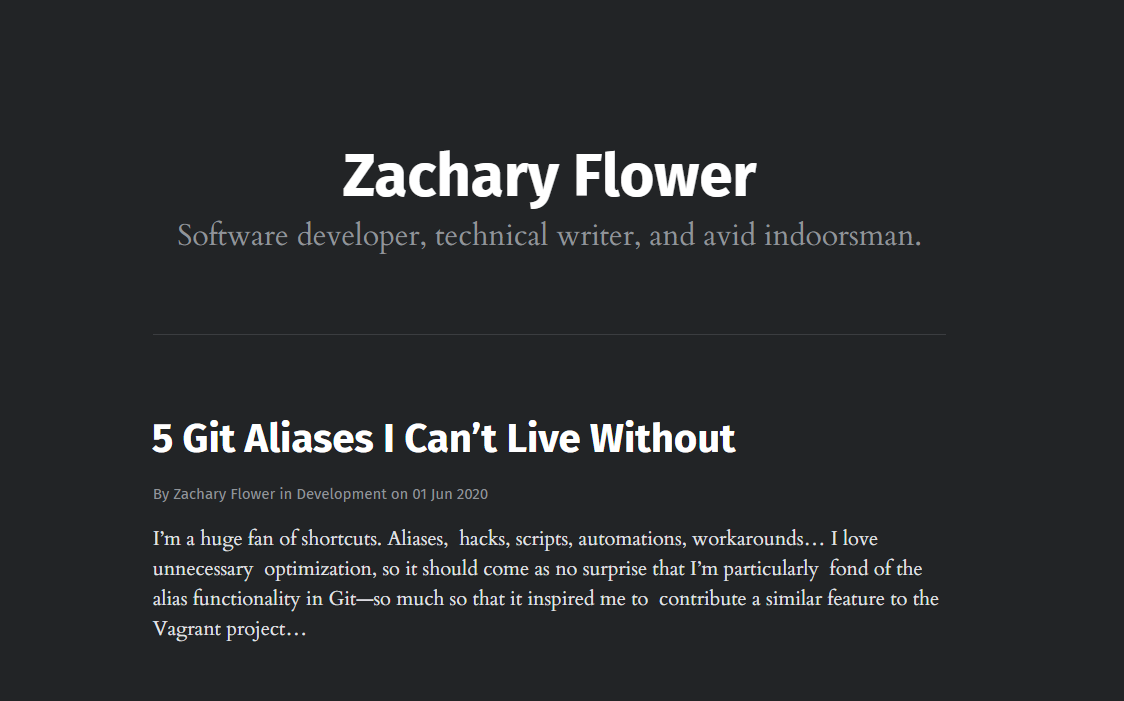
Then, come 2020, I decided to go with a more “modern” look. The color palette didn’t change a whole lot, but I did remove the menues and increase the focus on the content itself.
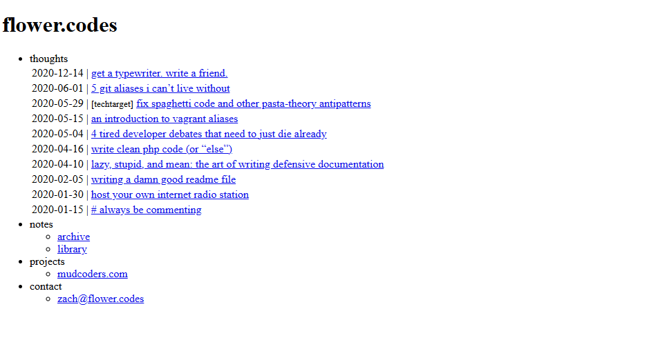
Then… COVID hit. I was working from home and leaning hard into design and technology choices that were better for my own mental health. This came through in a lot of ways, primarily very text-focused designs, a lot of whitespace, and a more “website like it’s 1999” aesthetic.
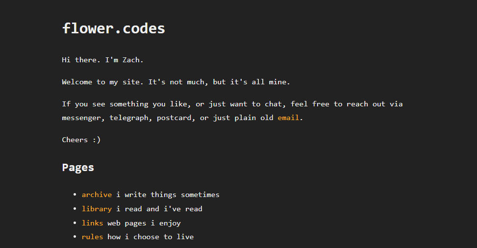
By 2022, I had settled into a design that I was really happy with. It was simple, clean, easy to read, and still maintained a very retro-minimalist aesthetic. But it was also a little boring in some ways. It become less “personal brand” and more “personal website.”
Yesterday, Today
I’ve been happy with my minimalist aesthetic for quite some time, but a big part of my curriculum as a teacher is a discussion on personal branding, and how the communication and design choices you make online can impact your career. So, I thought it was time to take a step back and re-evaluate my own design choices.
I think, despite all of the iterations of this blog, the “Selfy” inspired theme I used in 2014 was still my favorite—which probably has more to do with the fact that my eldest daughter was born that year than anything else, but I digress. It balanced a professional aesthetic with a personal touch, and I think it did a good job of representing me as a person.
The only problem, as you might have surmised by now, is that “Selfy” doesn’t exist anymore—and even if it did, it was a WordPress theme, and I haven’t used WordPress in at least 6 years.
So… what is an overworked nerd-turned-teacher to do?
If your answer was to recreate it myself from scratch, then you would only be half correct. I did recreate it from scratch (as you can see above), but I honestly couldn’t be bothered to do it all myself, so I enlisted the aid of some of these new fangled “AI” tools to help me out.
“Vibe Coding” gets a rightfully shitty rap, but in this case, it turned out to be a pretty great way to get the ball rolling. Personally, I used Claude 3.7 on GitHub Copilot in Agent mode, and I was able to turn around a full redesign in about a day—granted, I had to do a lot of tweaking and fixing, and the CSS organization is a mess, but it’s a solid starting point that would have taken me weeks to get to on my own.
So… for those of you who aren’t reading this on an RSS feed, what do you think?